The source of truth for the CanAsia visual identity: colour, type, logo, photography, icons, spacing, shape, and depth. Follow these decisions whenever you create or update anything for CanAsia.
The foundation section records the purpose, vision, mission, and voice that should guide every CanAsia touchpoint. Where the organization has not settled a decision, it stays visibly open.
Not yet formally stated. The closest real material is the homepage's own framing: “A Pacific Rim marketplace for games and interactive media — joining the world's largest tech conference.”
No stated vision beyond the event programme itself yet. The homepage's Why Now section gestures at one: “The Pacific Rim is where Canada's interactive sector already lives. CanAsia formalizes it.”
Not yet articulated as a mission distinct from the event's own operating model — see The Model on the homepage for the closest real statement of how CanAsia intends to work.
The character of CanAsia's communication: clear, confident, and open to the Pacific Rim community it brings together.
The CanAsia Game Summit lockup is supplied in four approved colourways. Use the light and navy versions on light surfaces, and the dark and white versions on dark surfaces. The artwork is supplied, not retyped.
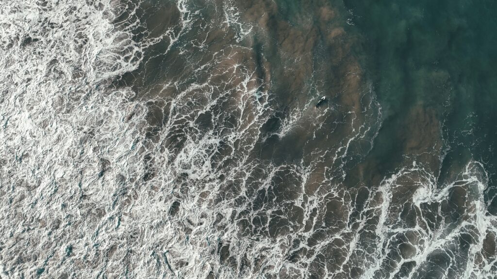
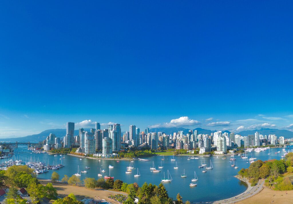
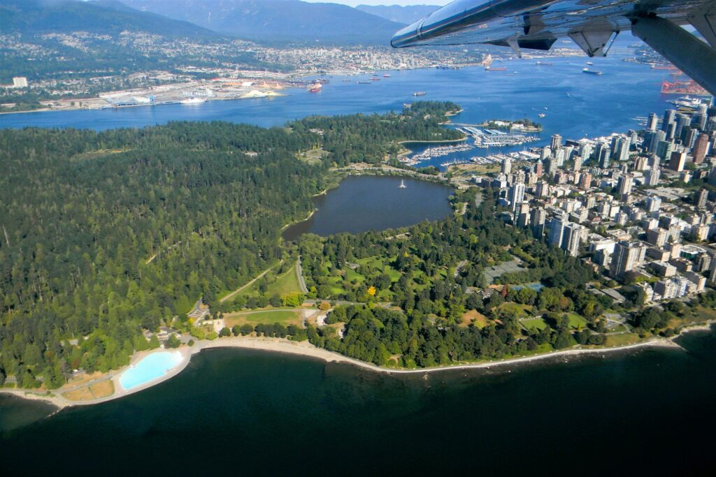
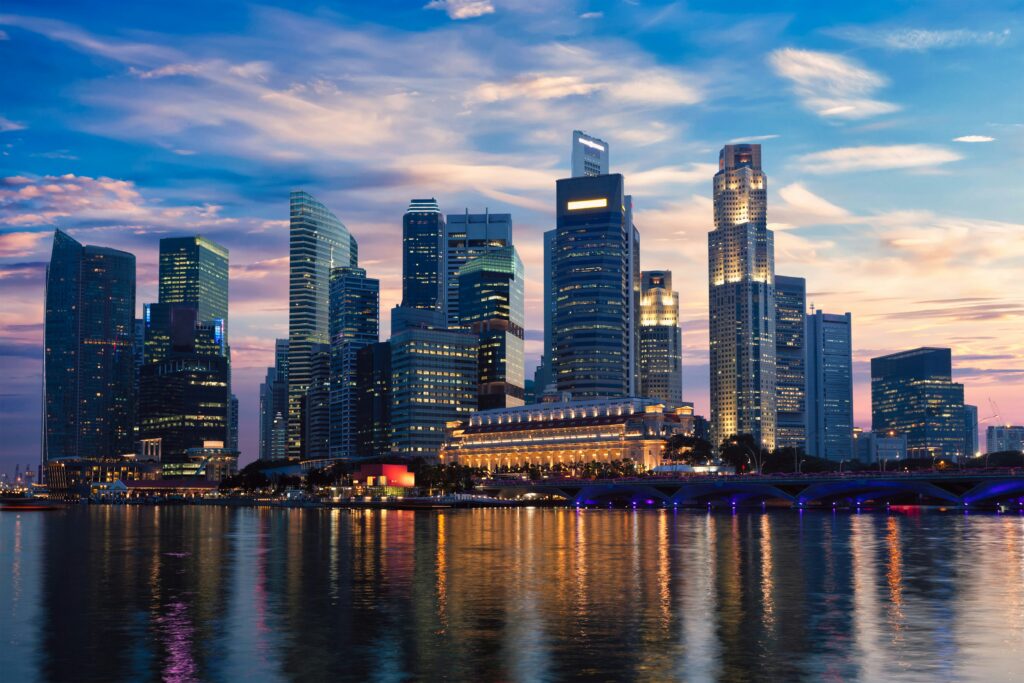
Photography should document the people, places, and work around the CanAsia program. This grid is queried from the media library so it reflects the current source material.






Static icons support navigation, utility actions, and short inline references without competing with the content.
 chat-centered-dots
 calendar-blank
 camera
 cloud-arrow-down
 file-archive
 folder-dashed
 gear
gear
 globe-hemisphere-east
 heart
heart
 house
house
 image-broken
 lightbulb-filament
 lightning-a
 lock-key
 map-pin-area
 moon
moon
 music-notes
 paint-brush-broad
The palette is organized by job: Dark anchors body text and framing, Deep blue carries the primary identity, Sky blue provides a lighter supporting accent, and pink is reserved for calls to action.
Neutral surfaces create a quiet field for the programme's content, with dark reserved for strong contrast and framing.
These three blues form the primary CanAsia colour family: Dark anchors the identity and body text, Deep blue carries the main brand presence and regular supporting copy, and Sky blue provides a lighter supporting note on dark surfaces.
A restrained neutral scale supports readable text, quiet fills, dividers, and borders without competing with the brand colours.
Pink is reserved for calls to action, giving the clearest interactive moments a distinct visual signal.
Supporting colours are limited to illustration and wordmark work so the everyday interface stays focused.
Form and message states. Not brand colours, so reused verbatim from this workspace's own standing convention rather than invented per client.
Typography has separate visual roles rather than one label per HTML level. Use these names consistently in CanAsia designs, content, and implementation. Every size below renders from the live --type-* token — nothing on this page is a recreated specimen.
Lead paragraph, the first sentence in a section.
Body copy, the standard reading size.
Scale check, min–max, must stay in this order at every viewport width:
Display 48–88 > Title 36–60 > H2 32–52 > H3 22–32 > Lead 20 > Body/Label 14 > Micro 12
Two line-height bands, not one setting per element: tight (.82–.98) for every Display/H1/H2/H3, where the glyphs are large enough that loose leading reads as broken, and loose (1.4–1.55) for Lead/Body/Body small, where reading comfort matters more than compactness. A heading using the loose band or a paragraph using the tight one is a bug, not a style choice.
Alignment follows content shape, not position on the page: hero and section-intro copy that's short and centred stays centred; anything that's a real paragraph (About, Why Now, prose subheadings, card copy) is left-aligned, because justified-center prose is harder to read past 2 lines. Vertical rhythm after a heading is one shared rule — margin-top on the next element, from the spacing scale below, never a one-off px value guessed per section.
Veneer ships as a single 400-weight face, and we always use it at that weight. Every H1, H2, H3, Display heading, and CTA on this site is rendered at font-weight: 400. Weight is expressed through size, colour, and layout, not through the browser inventing thicker strokes on a face that was never designed for them. The audit above also found two live violations of this exact rule (.section__heading and a bare <strong> stat label both forcing bold on Veneer) — fixed the same pass.
Fake-bold synthesis (any font-weight above 400) fills in VeneerThree's texture cracks and reads blobby, especially above ~90px and on dark backgrounds. Because we don't use it, we don't need to design around it.
Documented identically in colors_and_type.css, llms.txt, and the theme README.md. Change all four together if the rule ever changes.
Spacing sets the rhythm, radius gives each edge its character, and elevation establishes hierarchy. These are fixed scales, so every layout decision can be reused instead of re-invented.
The space between elements. Use the defined scale rather than inventing values between the steps. Smaller values control component rhythm; larger values separate content groups and sections.
Radius gives each interface edge a consistent character, from square structural surfaces to soft cards and pill-shaped actions.
The visual difference between surfaces. Flat is the default; borders and shadows are used only where they clarify hierarchy, grouping, or interaction.
The current action style is a filled pink pill. Keep it reserved for the primary action until secondary and tertiary treatments are formally designed.
One level of emphasis today: a filled pink pill for the single call to action on the page. The outline action below is reserved for supporting actions, while tertiary links remain text-only.
Primary navigation uses WordPress menu items. Links are uppercase labels with a quiet grey rollover, a visible focus ring, and no decorative fill at rest.